
TL;DR

Turn quiet afternoons into listening time
- Thousands of audiobooks, podcasts and originals
- Listen on your phone, tablet or Echo — also offline
- Cancel anytime
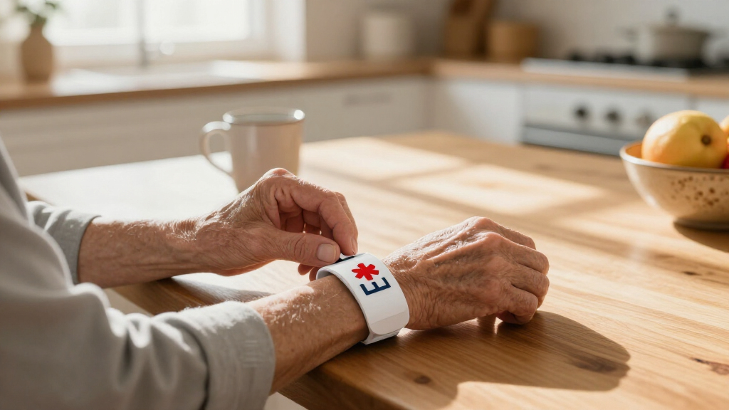
Large-print medical alert bracelets are identification bands designed to make essential health details easier to read, but “large print” has no single industry standard. Choose high-contrast, durable lettering the wearer can read comfortably, put the most urgent information on the band itself, and check the fit and accuracy regularly.
A medical alert bracelet can carry life-relevant information on a surface smaller than a name tag. If the letters are cramped or hard to see, the most carefully chosen words may be of little use when someone needs to read them quickly.
Large-print medical alert bracelets are designed to make essential health information easier to spot and read, especially for people with low vision and older adults. But “large print” does not follow a single standard, and a bigger font still has to fit on a wearable band.
This guide walks you through the details that matter: how to judge readability, what to put on the bracelet, which materials and features deserve a closer look, and how to keep the information useful. You will also see why a QR code can add detail without replacing readable text on the band.
“Large print” has no single standard for medical alert bracelets, so test the actual text size and contrast.
Put the most urgent, treatment-relevant detail in readable wording on the bracelet itself.
Compare engraving, material, fit, closure, and QR-code terms before choosing a band.
Treat a QR profile as extra detail, not a replacement for visible text or a current medical list.
Review the bracelet after health changes and check regularly for worn lettering, poor fit, or outdated contacts.
What makes a medical alert bracelet easier to read?
Large-print medical alert bracelets are identification bands designed to make essential health information easier to read, using features such as larger lettering, clear spacing, and strong contrast. The phrase is not a standardized product category, so one seller’s “large print” may not look like another’s. Test the actual engraving instead of trusting the label alone.
Readability depends on more than letter height. Contrast helps letters stand out from the bracelet; spacing helps distinguish one word from the next; and a simple typeface is easier to recognize quickly than decorative lettering. These features matter because a person trying to identify an alert may have only a brief opportunity to notice it. A larger font that crowds the words together can be less useful than slightly smaller text with clear spacing.
Imagine your father has low vision and wears a stainless-steel bracelet with “PENICILLIN ALLERGY” etched across the front. If the words look sharp against a light surface and remain readable at a comfortable distance, that may serve him better than a band with a longer message squeezed into tiny letters. Contrast and clarity count as much as font size.
When comparing bands, look at a close-up photo, then ask whether the seller can provide engraving dimensions or a sample image at actual size. If possible, have the intended wearer try to read the sample in ordinary indoor light. A phone camera or magnifier can help you compare products, but the finished alert should not depend on either during an emergency. This check also reveals a common tradeoff: fitting more words may require reducing the type size or spacing, so prioritize the message rather than filling every available surface.
Consider the whole face of the band, too. A familiar medical ID symbol, uncluttered layout, and wording on the side people can see may help someone notice the alert. Still, visibility is never guaranteed: sleeves, lighting, movement, and the situation itself can all get in the way.
Popular right now

Vitamix Propel Series 750 Professional-Grade Blender, 4 Programs, Black
Apple AirPods Pro 3 Wireless Earbuds with Active Noise Cancellation

Shark PowerPro Reveal Plus Cordless Vacuum Cleaner, Charcoal, IZ376H
As an affiliate, we earn on qualifying purchases.
Choose the health details that deserve the limited space
Put the information most likely to affect emergency care on the bracelet, and keep the wording brief enough to read quickly. A severe allergy, an important condition, a medical device, or a critical medication may be more useful than a full list of diagnoses. Ask a healthcare professional which details matter for your circumstances.
The reason to prioritize is practical: the bracelet has limited space, and a long list can make the most urgent alert harder to find. Information that could change immediate care should generally take precedence over details that are important for a fuller medical history but less useful as a quick signal. The right choice depends on the wearer’s situation, so confirm relevance with a healthcare professional rather than assuming every diagnosis belongs on the band.
For example, someone with a severe allergy might use the front of the band for “SEVERE LATEX ALLERGY.” Another person may need “PACEMAKER” or an alert about a condition that could affect urgent treatment. These are examples, not universal instructions; what helps one person may be unnecessary or unclear for another.
Use plain language where space allows. Abbreviations can save room, but a short code that only the wearer understands may not help a stranger. If you are considering a compact phrase, ask a clinician whether it is clear and relevant. Prioritize the urgent alert, then use the back of the bracelet or a separate medical information card for extra details.
Bracelets are identification, not a complete medical record. A printed medication list and emergency plan can provide more context for caregivers, clinicians, and responders. A simple example: the bracelet flags a severe allergy, while a wallet card gives the full medication list and an emergency contact. Together, they offer more useful detail than a tiny band can hold, while avoiding the risk that squeezing in extra text makes the key alert difficult to read.
Compare engraving, materials, and QR codes before you buy
The right bracelet combines readable, lasting identification with a fit the wearer will accept every day. Materials, engraving location, closures, and digital features all involve tradeoffs, so compare the details rather than picking by appearance alone. Bands designed to suit different activities can look polished, but comfort and legibility need to work in real life.
| Feature | What to check | Possible tradeoff |
|---|---|---|
| Engraving | Ask whether text is engraved or otherwise made to resist fading, and check the front and back. | More durable lettering may limit how much information fits. |
| Material | Compare silicone, stainless steel, titanium, and other options for comfort and skin sensitivity. | A sturdy metal may feel heavy; a softer band may need different care. |
| QR code or online profile | Check privacy settings, any ongoing fees, and what happens if the service disappears. | It can hold more detail but depends on someone noticing and scanning it. |
| Closure and fit | Check that the clasp stays secure and that the wearer can put the band on and remove it. | A very secure closure may be harder to manage independently. |
These tradeoffs affect whether the alert works beyond the moment of purchase. Engraving that resists wear helps preserve the message, but a limited surface means deciding which words earn that space. A comfortable material can encourage consistent wear, while a heavy or irritating band may be left at home. And a closure that is easy to operate supports independence, but it still needs to stay secure during ordinary activity.
Product designs increasingly combine visible engraving with QR codes or online profiles. That extra profile may hold a fuller history, but a scan can depend on a suitable phone, network access, and conditions that allow the code to be read. Keep the most urgent information visible as ordinary text on the bracelet itself. The QR option is most useful when it adds context without making the wearer dependent on a scan for the basic alert.
For a person who swims often, for instance, manufacturer guidance on water resistance and care matters more than a glossy product photo. Someone with sensitive skin may need a different material. Check whether the service charges a subscription, how you update information, and what data you share before adding an online profile. Those terms matter because recurring fees, privacy choices, or a service closing down can affect whether the linked information remains available over time.
Check the fit and readability with this four-step test
Test a medical alert bracelet on the person who will wear it, using the actual wording and intended fit before you rely on it. This quick process helps catch problems that a product listing cannot show, such as letters that look too small or a clasp the wearer cannot manage. Testing matters because a bracelet is only useful if the wearer can keep it on and its message remains legible in everyday conditions.
- Choose the message. Ask a qualified healthcare professional which emergency details matter, then keep the bracelet wording concise. A focused message leaves more room for readable lettering and helps the central alert stand out.
- Inspect the lettering. Look for clear, high-contrast engraving and check the finished text at its actual size, not only in a magnified online image. A polished product photo can make tiny text appear readable, so judge it in ordinary light and at a distance the wearer finds comfortable.
- Try it on. Confirm the band sits comfortably, does not irritate the skin, and has a closure that works for the wearer. If putting it on takes assistance the wearer does not reliably have, even a clear and durable bracelet may not be worn consistently.
- Check it during an ordinary day. See whether sleeves cover it, whether the text stays visible, and whether the wearer can put it on and remove it as needed. This step reveals whether the band’s design works with the wearer’s routine, not just in a stationary test.
Consider a real morning routine: your aunt gets dressed, pulls on a sweater, and reaches for her keys. Does the bracelet remain visible? Can she fasten it without asking for help? Does she find the weight comfortable after several hours? Those small, ordinary tests reveal whether a bracelet is practical—not just attractive in a box. If visibility or comfort is a problem, a different placement, material, or closure may be a better compromise than trying to adapt the wearer to the bracelet.
If you are choosing for a child or someone with dementia, check regularly that the bracelet remains in place and fits comfortably. A band that is too loose may slip off; one that is too tight may irritate the skin. Follow the maker’s care guidance, and ask a qualified professional if you have questions about suitability or fit.
Keep the bracelet accurate without treating it as a guarantee
A medical alert bracelet can support emergency communication, but it cannot guarantee that someone will see it, scan a QR code, or follow a particular treatment. Use it as one part of an emergency plan, alongside current medical records, a medication list, and conversations with healthcare professionals. This distinction matters: the band is a quick signal, not a complete account of a person’s health or a promise about how an emergency will unfold.
Information can become outdated. If a diagnosis changes, an allergy is confirmed, or a medication detail is no longer relevant, review the bracelet and any linked profile. For example, if a wearer changes emergency contacts after moving, updating only the online account leaves the printed information card behind—and an old contact on the band may no longer reach the right person. Inconsistent sources can create confusion, so check every place the information appears when something changes.
Set a simple reminder to inspect the band after major health changes and at regular intervals. Check for worn lettering, a loose clasp, skin irritation, and information that no longer matches the wearer’s situation. A clear engraving can still fail as an alert if scratches have made a key word hard to read. Regular checks are a way to catch these gradual problems before the message or fit becomes unreliable.
Keep a backup source of detail somewhere accessible, such as a wallet card or a current medication list. A QR profile can hold more information, but it introduces dependence on a scan, a device, and possibly a website. Check the provider’s privacy settings, fees, and service availability rather than assuming the digital link will always work. Keeping essential text on the band and fuller details elsewhere balances quick visibility with the need for context.
Make the bracelet useful in the wearer’s everyday routine
A bracelet helps most when the wearer can and will keep it on, and when the information remains easy to find. That means making comfort, habit, and visibility part of the choice—not treating the band as a one-time purchase that takes care of itself.
Suppose your partner removes jewelry before washing dishes because a metal clasp catches on clothing. A softer style or different closure may fit better, provided it still displays clear, durable text. If the wearer has a skin sensitivity, test the material according to the manufacturer’s guidance and stop using a band that causes irritation; a healthcare professional can help with persistent concerns. The key is finding a workable balance: a bracelet that is readable but routinely removed may provide less practical value than a comfortable option the wearer is willing to keep on.
Keep the bracelet in the same familiar place when it is not being worn, such as beside the watch or keys. If a caregiver helps with dressing, build a quick check into that routine: Is the band on? Can you read the key words? Does it still fit? A predictable habit is easier to maintain than a complicated checklist, and it can catch a missing or damaged bracelet before it is needed.
Small design choices can make essential health details easier to communicate: a readable phrase, visible placement, and a band that feels comfortable enough to wear. The aim is not to fit a medical chart onto a wrist. It is to make the first, most relevant signal simple to see and understand.
Frequently Asked Questions
How large should the print on a medical alert bracelet be?
There is no single standard size for large print on medical alert bracelets. Choose the largest lettering that fits while staying clear, and have the intended wearer test it at a comfortable reading distance in ordinary light.
What information should I put on a medical alert bracelet?
Prioritize a severe allergy, a condition that could affect emergency care, an important device, or another detail that a healthcare professional says is relevant to you. Keep the wording brief and understandable; use a card or medical record for fuller details.
Should I choose a QR code instead of engraved text?
A QR code can link to more information, but someone must notice and scan it, and access may depend on a phone or network. Keep the most urgent alert in readable text on the bracelet and treat the profile as a supplement.
Will first responders always notice a medical alert bracelet?
No design can guarantee that someone will see or recognize a bracelet. Sleeves, lighting, movement, and the circumstances of an emergency can affect visibility, so use the bracelet as one part of a broader emergency plan.
Do medical alert bracelets replace a medication list?
No. A bracelet carries a short alert, while a current medication list and fuller medical history provide more detail for routine care and emergencies. Keep those records accessible and update them when information changes.
Conclusion
Choose a bracelet the wearer can read, tolerate, and keep on, then put the clearest urgent information where another person can see it. A QR code or wallet card can add detail, but the visible words on the band should carry the first message.
Test the bracelet in the light of an ordinary day, not just under a bright shop photo. The best alert is the one that stays clear on a moving wrist, beneath a sleeve, and when it matters.